The truck in miniature
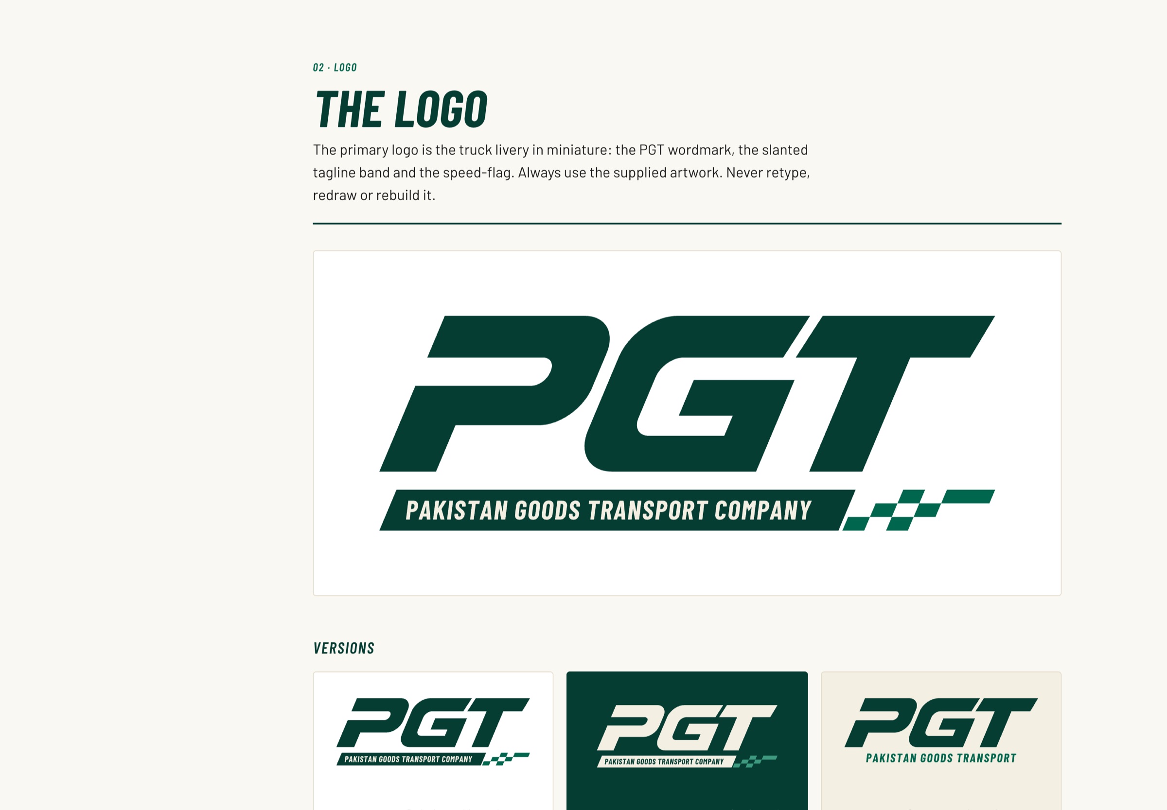
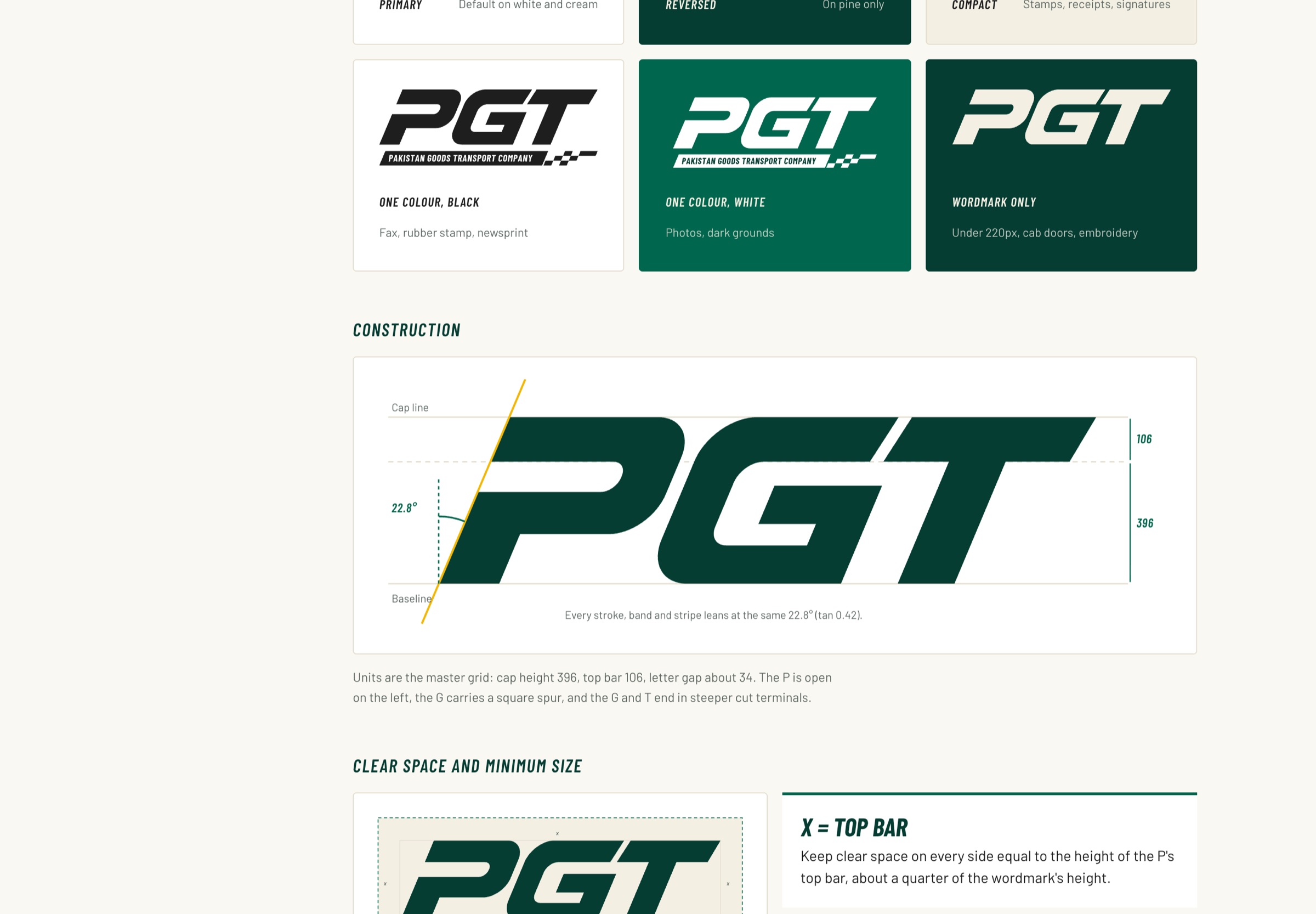
The primary logo is the livery itself: the PGT wordmark, the slanted tagline band and the speed-flag, with versions for every background.
Brand guidelines for PGT, taken straight from the side of its trucks: a bold forward-leaning wordmark, a slanted tagline band, a checkered speed-flag and a pine-and-cream palette for fleet, web and paperwork.
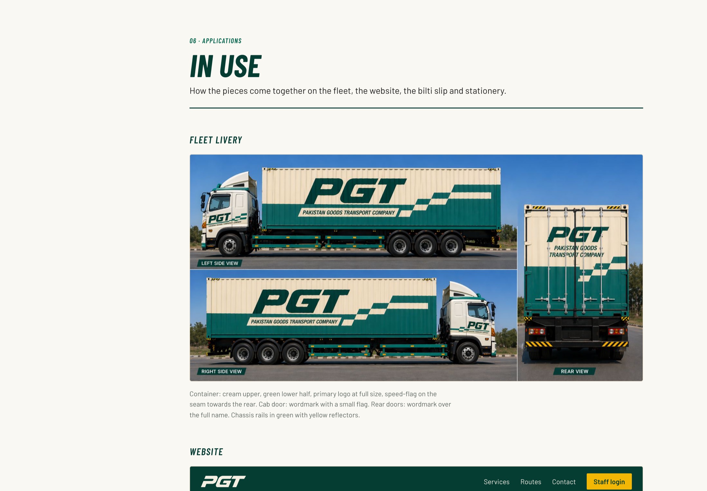
PGT’s trucks already carried the brand: a cream container, a deep green lower half, a bold forward-leaning name and a checkered stripe that says the load is on the move. The guidelines turn that livery into a system the family can use everywhere — on the fleet, the website, the staff portal and the bilti slips customers keep.
The primary logo is the livery itself: the PGT wordmark, the slanted tagline band and the speed-flag, with versions for every background.
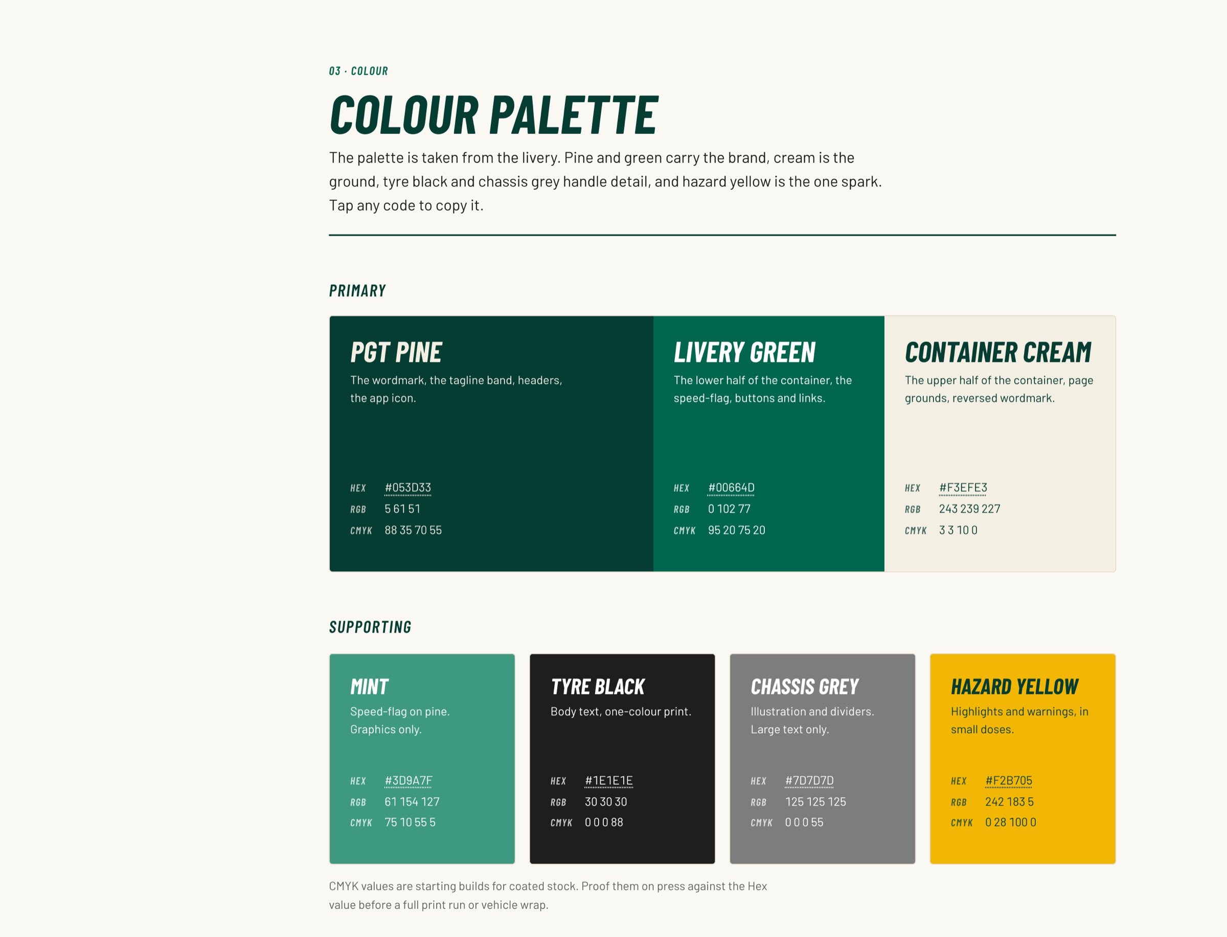
PGT Pine, Livery Green and Container Cream lead; Mint, Tyre Black, Chassis Grey and Hazard Yellow support, with approved contrast pairings.
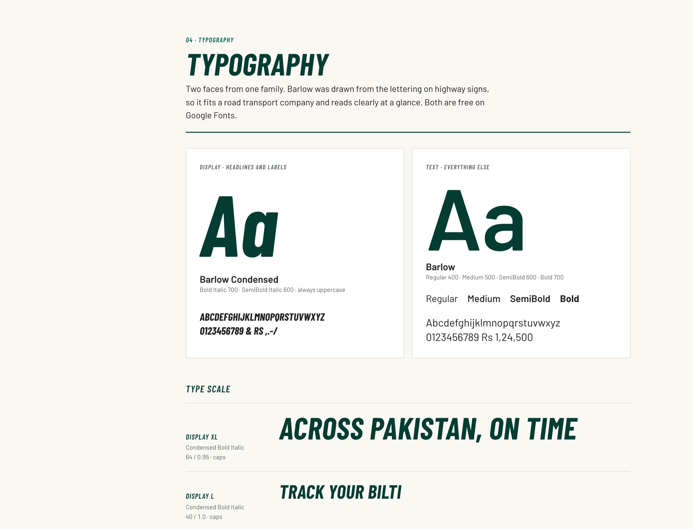
Barlow Condensed and Barlow, from one family drawn from highway-sign lettering, so it reads clearly at a glance.
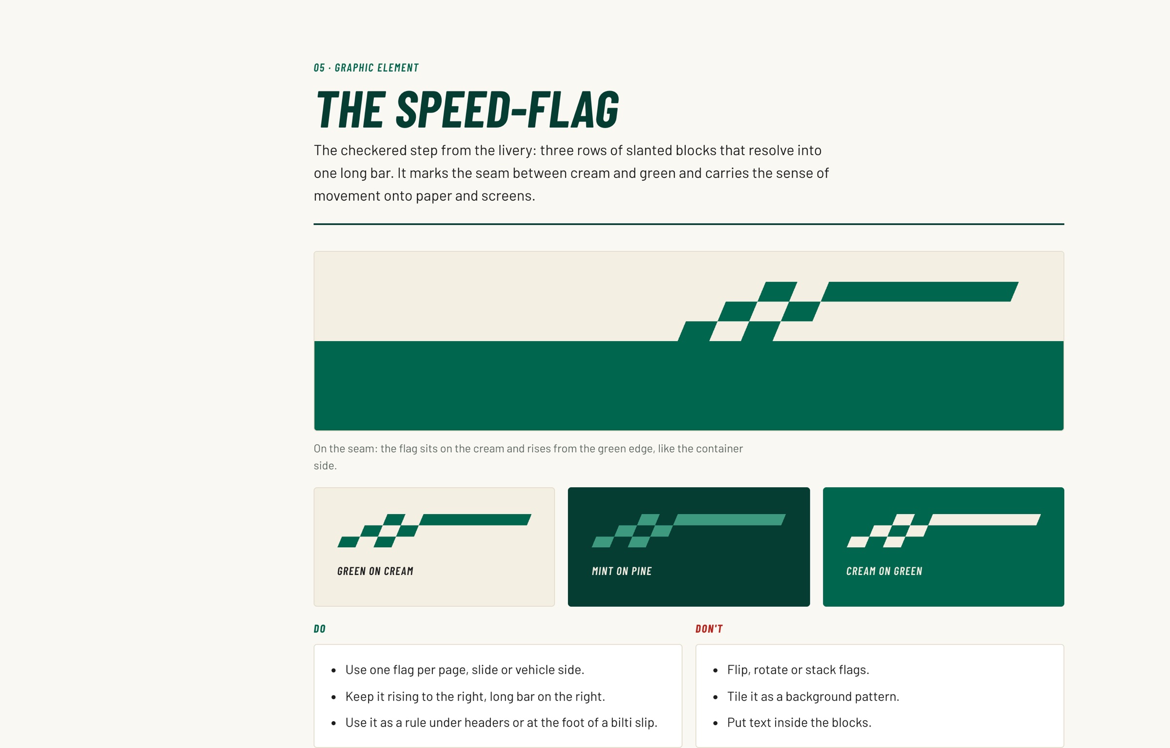
Three rows of slanted blocks that resolve into one long bar, used once per page as a sign of movement.
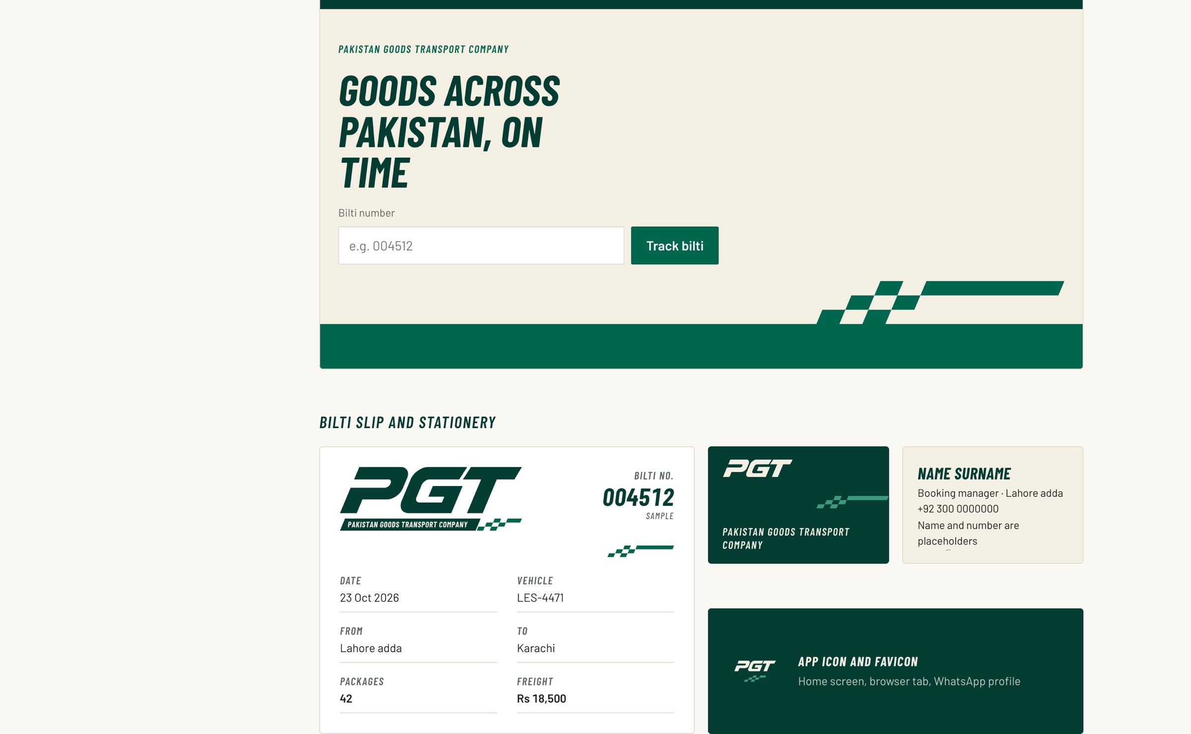
Fleet livery, the website header, bilti slips, stationery and the app icon all come from the same parts.