The penguin mark
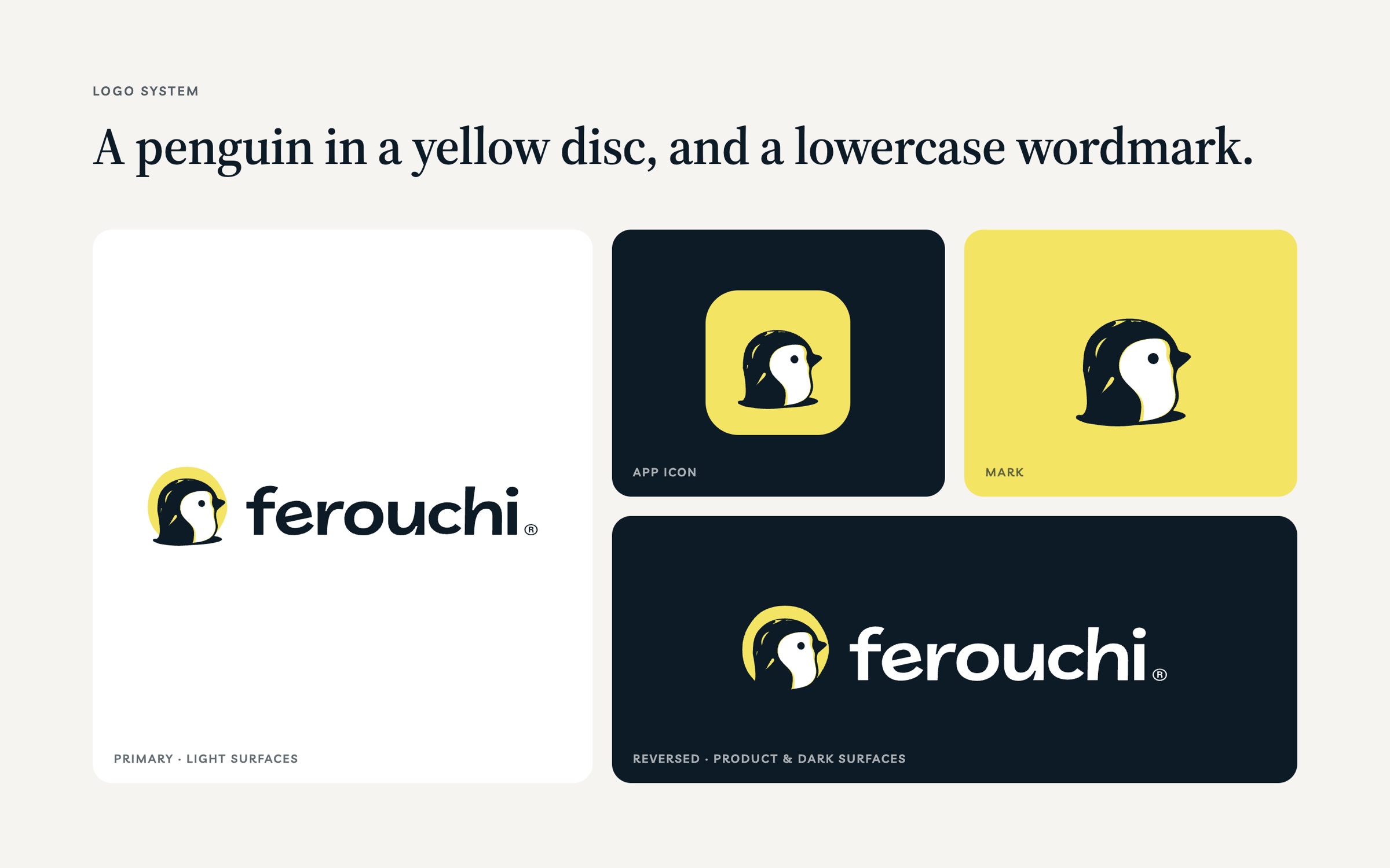
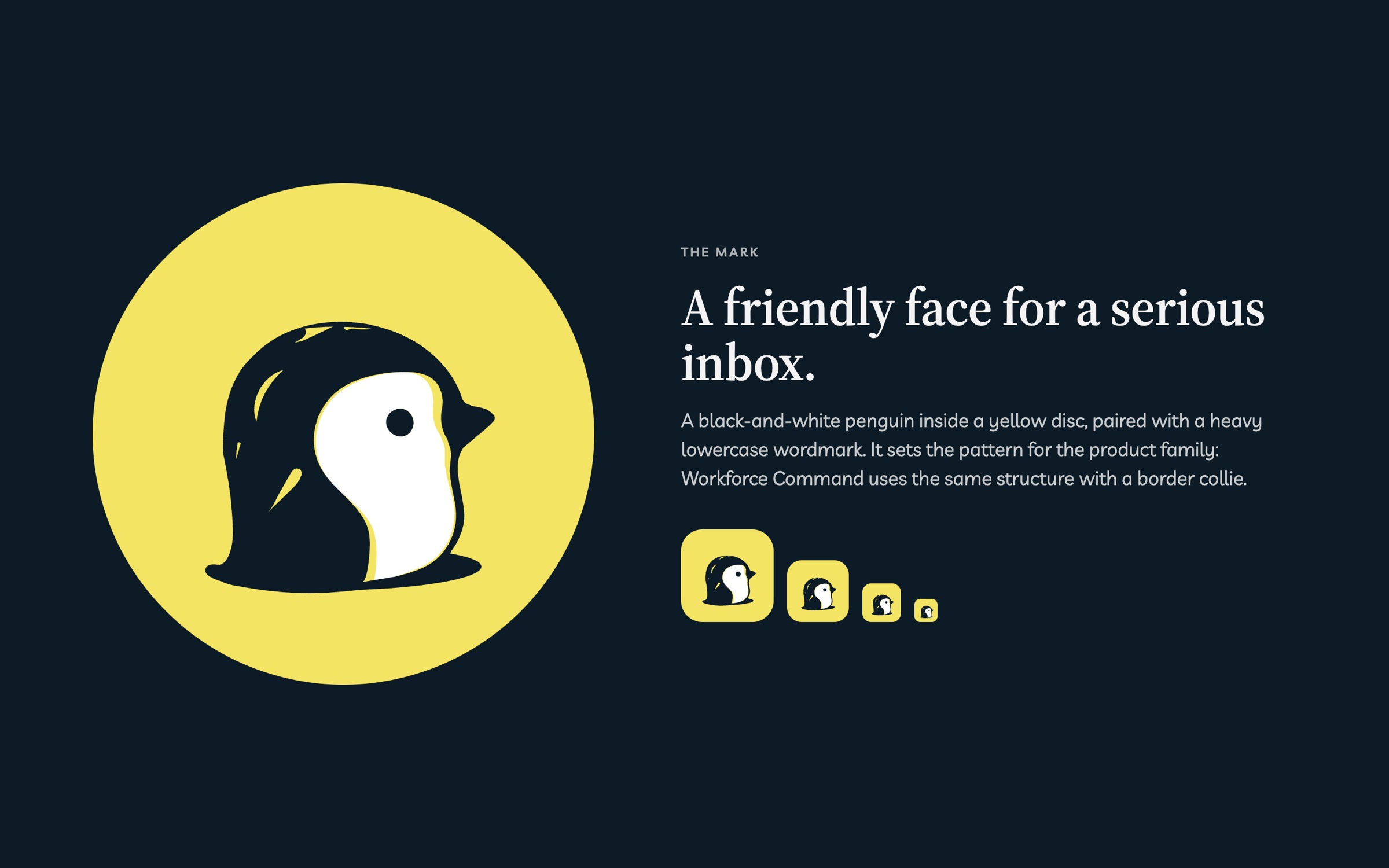
A black-and-white penguin inside a yellow disc, used as the logo, app icon and favicon down to 16px.
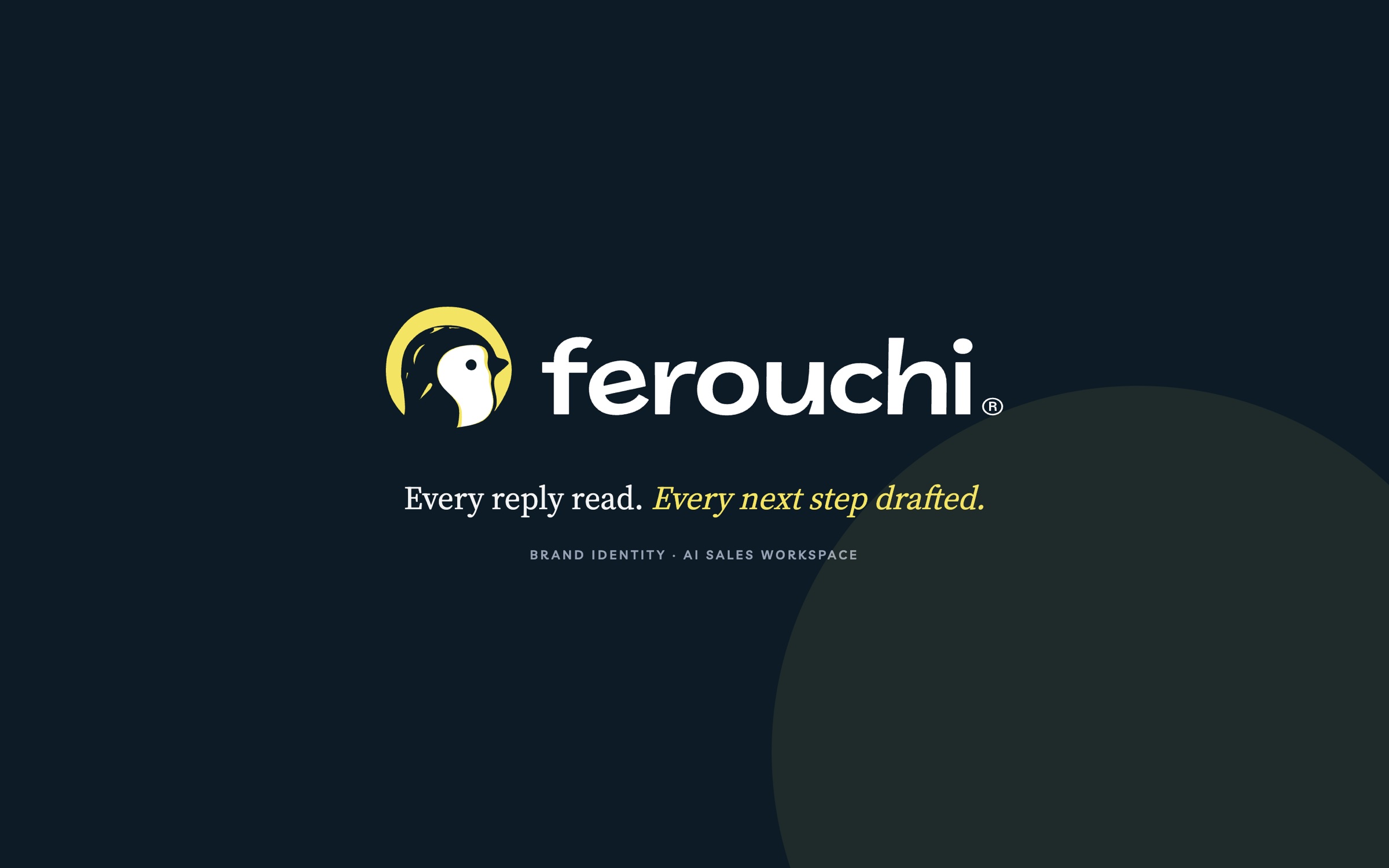
Brand identity for Ferouchi, an AI sales workspace: a penguin in a yellow disc, a heavy lowercase wordmark, deep navy and a small set of pastels that carry straight into the product.
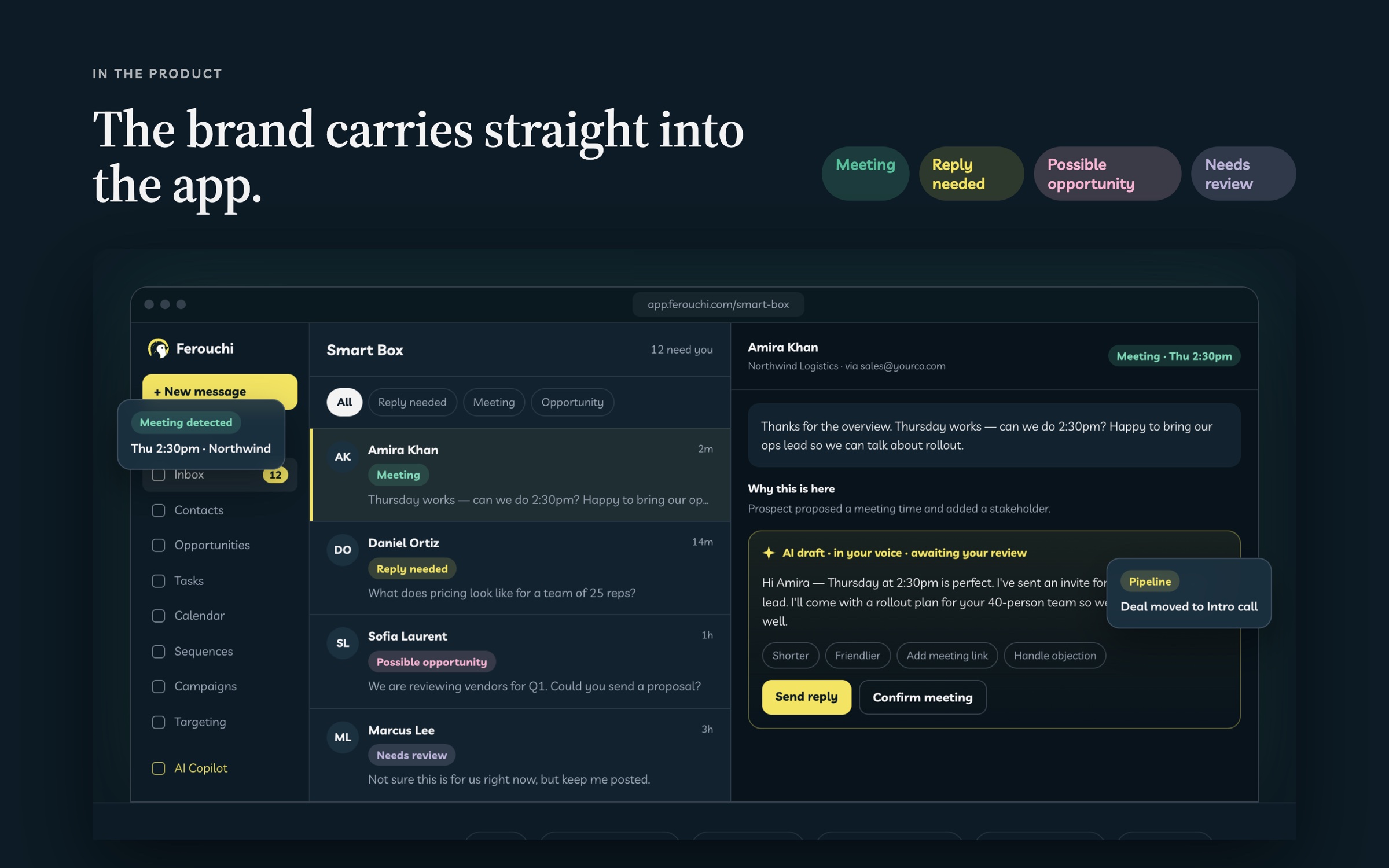
Sales tools tend to look loud. Ferouchi needed to feel calm and trustworthy to teams who let it read their inbox. The identity pairs a black-and-white penguin with one bright yellow, keeps the product on deep navy, and saves soft pastels for labelling replies and pipeline status. It also set the pattern for Workforce Command, its sister product.
A black-and-white penguin inside a yellow disc, used as the logo, app icon and favicon down to 16px.
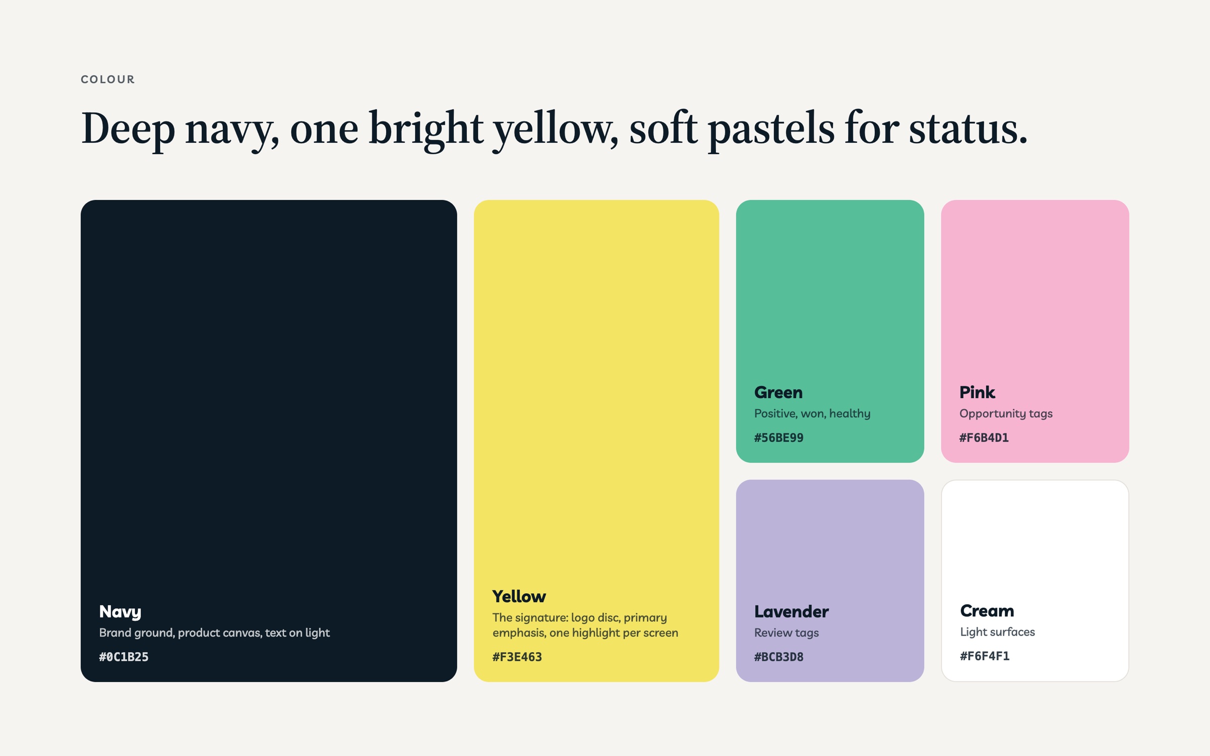
Navy is the ground for the brand and the product; yellow is the signature, kept to the logo and one highlight per screen.
Green, pink and lavender label meetings, opportunities and replies that need review, so the inbox reads at a glance.
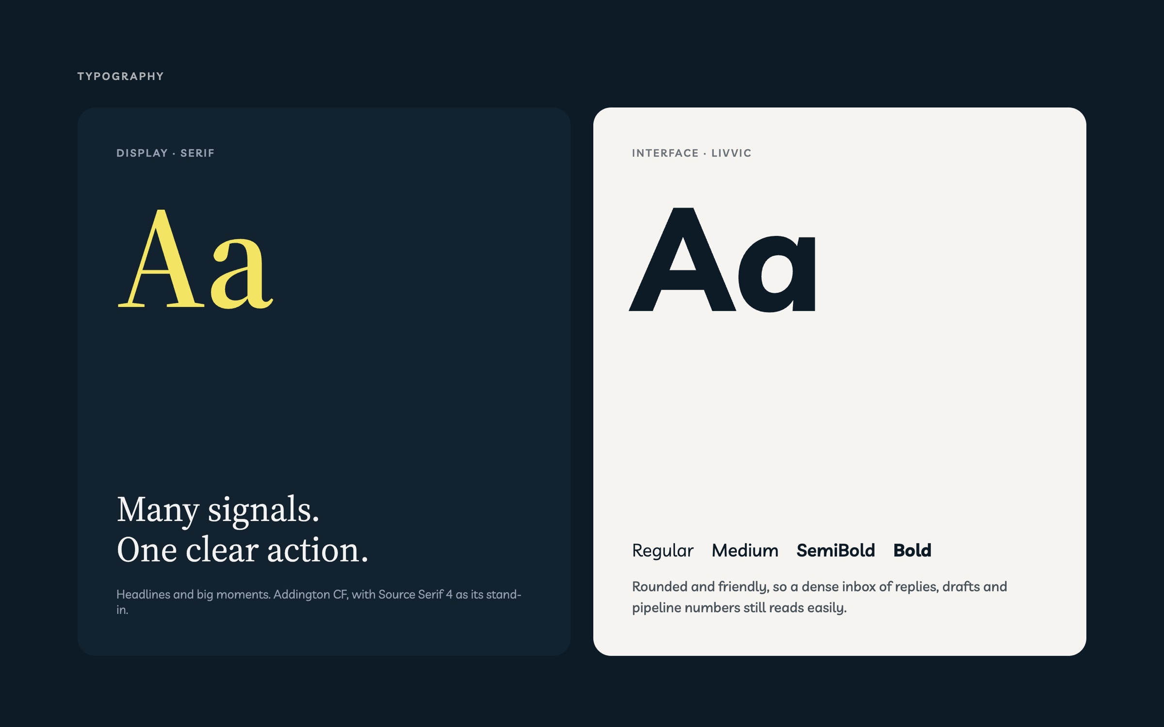
A serif display for headlines and big moments, and Livvic, a rounded sans, for the dense product UI.